CMA x FCAS

Brand & Digital Strategy: FCAS

Now, more than ever, we must stand up to all hate. Together.​ This powerful sentiment beats at the heart of Robert Kraft’s Foundation to Combat Antisemitism (FCAS). The influential non-profit is a force for good. It is a force for change. FCAS advocates for social equality in America and around the world. It mobilises people regardless of race, background or political allegiance, to Stand Up to hate and, perhaps most importantly, to Stand Up to the silence that enables it.

Making your mark in digital marketing is one thing; making a real difference in the world is another. So it was that the team at CMA was thrilled to join the campaign. In doing so, we partnered with global media giant GroupM and CMC Editorial, our stateside sister agency. The challenge? To refresh FCAS’s brand and website. The outcome? An enhanced user experience designed to educate people towards taking action against hate.

Let’s take a look.

CMAgency - The Content Marketing Agency - works with some sweet brands

FCAS BRAND REFRESH

Project Overview

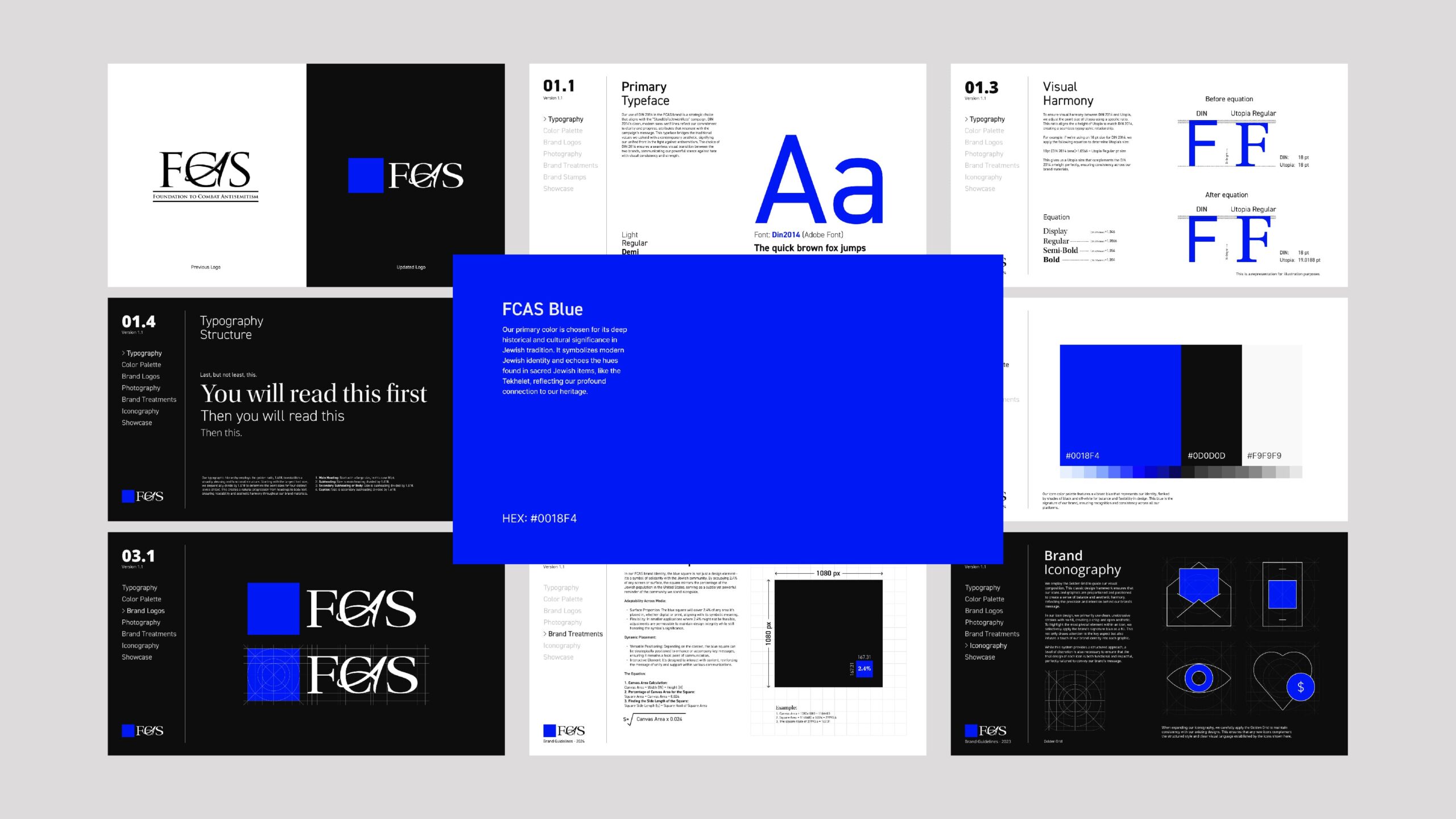
The brief was set: to intertwine successful elements of FCAS’ ‘Stand Up To Jewish Hate‘ campaign with its overarching brand, injecting a modern appeal into its identity without sacrificing the established ethos. This would mean updating the FCAS logo, typography and colour scheme. It would also mean clearly positioning FCAS as the parent brand to The Stand Up To Jewish Hate campaign and any future campaigns that would follow.

A key to unlocking this transformation was The Stand Up To Jewish Hate campaign’s blue square; a simple yet powerful symbol of unity that already resonated deeply with the campaign’s audience. More than a trend, using the blue square emoji 🟦 had become a unifying symbol of support.

CMA Core Deliverables
  • Creative Direction
  • Brand Storytelling
  • UX/UI Design
  • User Journey Mapping
  • Brand Development
  • Website Implementation
Project Objectives

Our objective was therefore to reinvigorate the FCAS brand and digital presence, creating a cohesive experience that bridged its impactful campaign with its core identity. This entailed:

  • A delicate logo update that honoured tradition while embracing modernity.
  • A typographical overhaul to align with the campaign aesthetics without losing brand consistency.
  • A strategic colour palette expansion for versatile brand expression across multiple media.
  • A brand strategy to integrate the blue square into the logo.
  • A website redesign focused on user journey optimisation to educate and incite action.
Process & Challenges

A process of discovery, research and strategy was rolled out. The initial phase involved a comprehensive UI/UX audit to highlight areas within the current FCAS website that required a redesign. Additional functionalities were integrated to enhance user engagement, leading to a restructured content strategy that prioritised educational outreach and community involvement.

In redefining the brand, we faced the challenge of blending the predetermined serif font of the parent brand with the sans-serif DIN 2014 of the campaign. The solution was Utopia – a serif typeface that symbolised tradition and resilience, which, when paired with DIN 2014, represented a harmonious marriage between heritage and innovation.

An equation was devised to match the x-heights of Utopia and DIN 2014, ensuring typographic fluidity. The FCAS logo was artistically reimagined, keeping the characteristic calligraphic ‘A’ and integrating the blue square to symbolise the Jewish population and the broader mission against hate.

From its Command Centre, FCAS shares real-time information, statistics and stories of relevance. It’s a place of truth designed to inform and educate end users. We saw it as a specialised news agency. One committed to sharing impartial information designed to combat hate through knowledge. This thinking was imprinted into the DNA of our typography choices. Playing on the traditions of news media, we maintained the serif font for the FCAS logo and main font hierarchy. This instantly lent a sense of authority and tradition, while infusing sophistication and ease of readability on the web.

Implementation

Cross-channel consistency was paramount. Typography across mediums was standardised, with strategic use of the blue square as a focal point. This was particularly the case on social media, where it would frame key statistics and messages. The colour block technique was used sparingly to maintain its impact, with text treatments carefully chosen to convey the importance of the content. 

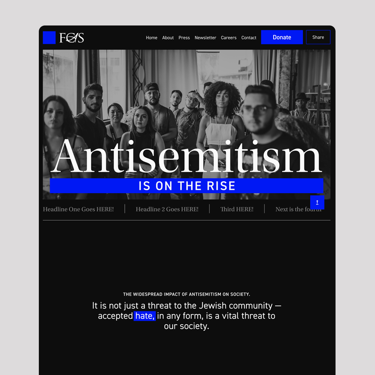
The website’s transformation centred around a seamless journey from awareness to action. New homepage features were crafted to present critical information effectively, guiding users through a narrative enriched with facts, leading them to engage with the campaign and, ultimately, to take a stand against hate.

Outcomes

The project culminated in a set of comprehensive brand guidelines and a revitalised digital presence. Let’s take a look.

The logo

The refreshed FCAS logo, along with its expanded colour palette, significantly enhances the brand’s narrative. This redesign not only underscores FCAS’s commitment to fighting antisemitism but also brings a modern aesthetic to its mission. Through thoughtful design choices, the logo serves as a visual testament to the Foundation’s dedication, ensuring its message resonates effectively in today’s digital age.

The Brand Guidelines 

FCAS’ brand guidelines ensure consistency across all media. They detail the refreshed logo’s role, extended colour palette, typography and all visual elements to embody the Foundation’s mission against antisemitism and hate. Visual communications now strategically use text and colour blocks for emphasis, employing DIN 2014 and Utopia typefaces to differentiate key messages and enhance engagement, ensuring clarity and brand consistency in all FCAS materials.

The website

The revamped FCAS website now stands as a pivotal educational tool and a rallying point for action, embodying the Foundation’s intensified commitment to combating all forms of intolerance. This digital platform has been designed to engage users, offering comprehensive resources and clear pathways to support the cause, thus reflecting the essence of the Foundation’s mission in a modern and accessible format.

Conclusion

The FCAS brand refresh and website redesign represent a significant stride in the Foundation’s journey towards a future where solidarity and action against hate speak louder than words. By embracing the symbolic blue square and intertwining it with a refreshed typographic and colour strategy, FCAS now stands with a renewed visual and digital identity ready to confront the challenges of the modern era.

Storytelling is now embedded into FCAS’ brand and digital presence, engaging users in this powerful narrative of unity and strength, strategically guiding them towards targeted call to actions. It was a pleasure to play a role in this most important of projects and, the fact that it scored us a touchdown on FCAS’ impressive Super Bowl campaign was a bonus – you can read more about that here.

Ready To Tell Your Brand Story?

Ready to turn your business or organisation into a page-turner? Then get in touch with CMA. Your brand story is waiting to be told. 

CMAgency - The Content Marketing Agency - works with some sweet brands

Services

Designer Marketing

You stay focussed on what you do best while we creatively, strategically and technologically calibrate all aspects of your operations from digital strategy, branding and marketing, to sales, retention, upsell and beyond. Want a piece of the action?

Marketing Services

Marketing Strategy | Content Strategy | Content Marketing | Social Media | Email | SEM & SEO | Paid Media | Reporting and Analytics | PR | Consultancy | Out-of-Home Advertising | Advertising Campaigns

Come Get Some

Design Services

Graphic Design | Web Design | UX/UI Design | Motion Graphics | Animation | Video Production | Audio Production | Brand Strategy & Development | 3D Design | Illustration | Print

Hey good lookin'

Development Services

Website Development | Ecommerce | Website Audit | Website Consultation | Software Development | App Development | Virtual Reality Development | Game Development

Develop with us

Technology Services

CRM Systems | Technology as a Service | Digital Transformation | ERP | Learn Management Systems

Let's Get Connected

Marketing Services
Design Services
Development Services
Technology Services

Let's Talk

You rock. We rock.
So, let's roll!

Whatever your sector. Whatever your trade. Whatever your passion. No sweat!